

Volunteer Opportunities Marketplace
Helping volunteers discover non-profit opportunities when they do not know where to start.
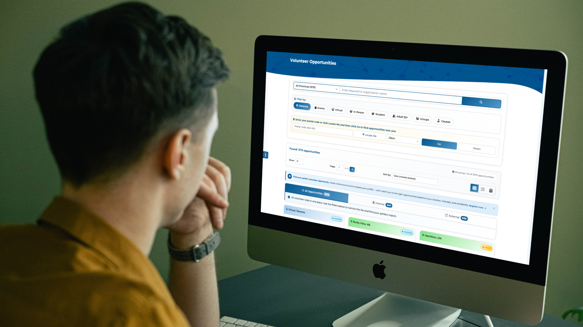
Final Volunteer Opportunities Marketplace experienceMy role: Senior product designer
Team: Developer, Director, Marketing, Stakeholders
Time to release: 21 days
Impact
~12K
Monthly visitors
15.5%
Avg. page bounce rate
1.5K+
Active opportunities
~14K
Google search clicks
~776K
Impressions Jan-May 2026
Problem
A volunteer wants to help, but does not know what opportunities exist or where to begin.
Volunteers without a specific opportunity or organization in mind are still trying to understand:
What types of volunteer work or roles are available
The location of or distance to the volunteer opportunity
Which organization needs help
Which causes interest them
What could fit their schedule
Whether they want an ongoing role or something on specific dates
What do they need to do
How long do they have to be present
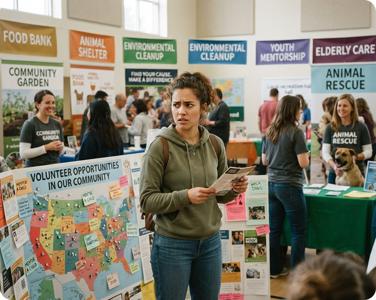
Female volunteer standing in the middle of a volunteer fair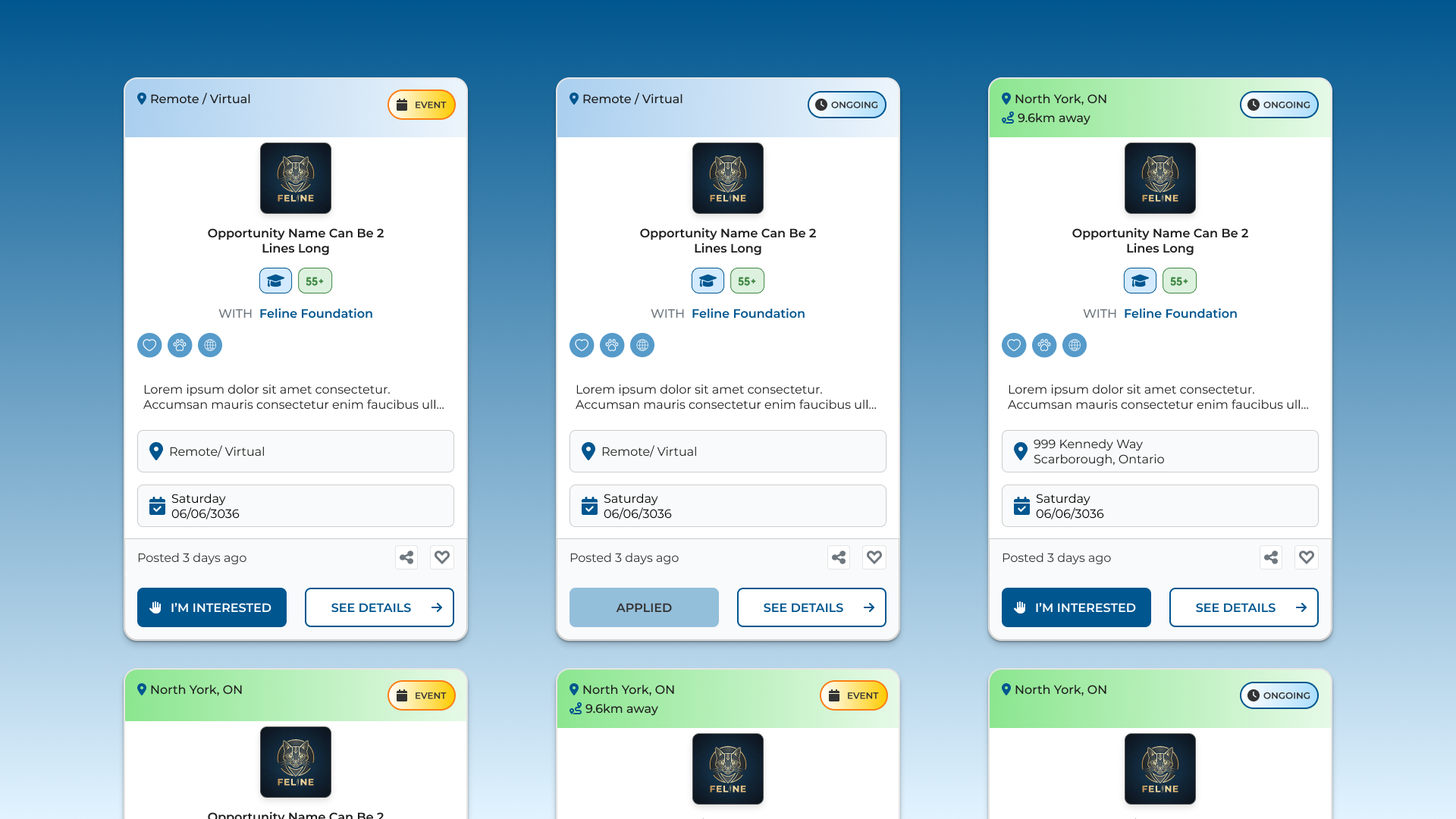
Last opportunity card design with AAA approved contrast on the badgesGoal
Create a volunteer opportunity browsing experience that feels easy to scan, understand, and act on.
The page needs to help users:
Browse opportunities without knowing what to search for
Understand an opportunity at a glance
Return to browsing without losing their place
Narrow results without configuring dozens of filters
Link and navigate to the full details for See Details
Sign up to an opportunity and see which ones they already signed up to
User Personas

Explorer Emily
Browses without a fixed goal and prefers to move at their own pace.
Typical behaviors:
Browses without a clear goal
Relies more on visual cues than text
Navigates between listings and details
Changes direction easily
Can lose their place in the list
May stop browsing because of choice overload or boredom
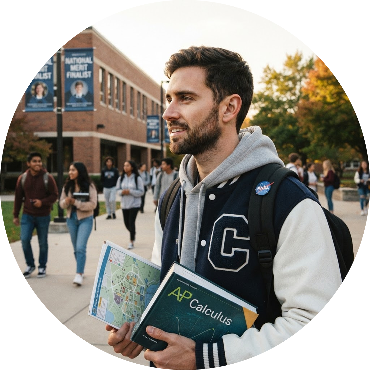
Goal-Driven David
Has a clear objective and needs an obvious path to complete it.
Typical behaviors:
Needs obvious affordances
Relies heavily on visible images, bolded text, clickable elements, and buttons
Can become overwhelmed easily
Prone to interaction errors when controls or outcomes are ambiguous
Loses context easily
Struggles when labels, controls, or outcomes do not clearly relate to their objective
Constraints & Considerations
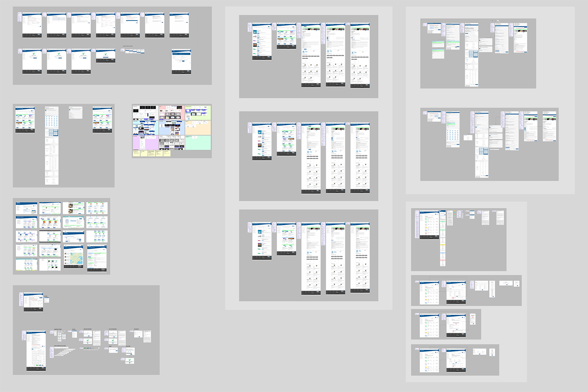
Connected screens, flows, and options workboard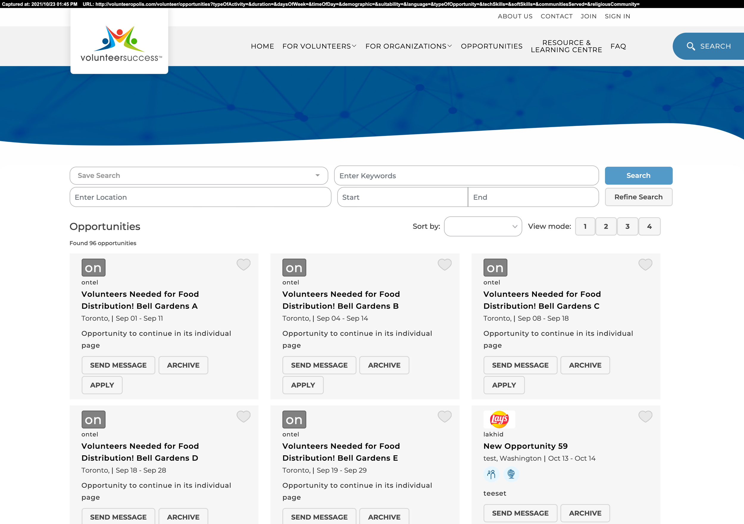
First edition of the Opportunities pageSimple browsing, broad functionality
Opportunities need to feel simple while supporting a broad range of users, opportunity types, and information requirements.
-
Anonymous
Volunteer
Manage sign ups
Organization
Hidden profile
Disabled contact
Manage opportunities
Manage volunteers
-
Who
What
Where
When
Why
-
Primary CTA “I’m Interested”
Preserve user’s place in opportunity list
Link to opportunity details page
Link to organization profile details page
Improved page performance through pagination
-
Sign up to opportunity
Favorite
Save search
Display distance to opportunity on card
Opportunity matching
-
Grid
List
Calendar
Details
-
Search bar
Suggestions
Quick filters
Distance
Events
Virtual
In person
Student
Adult 55+
Groups
Causes
Visual Discovery
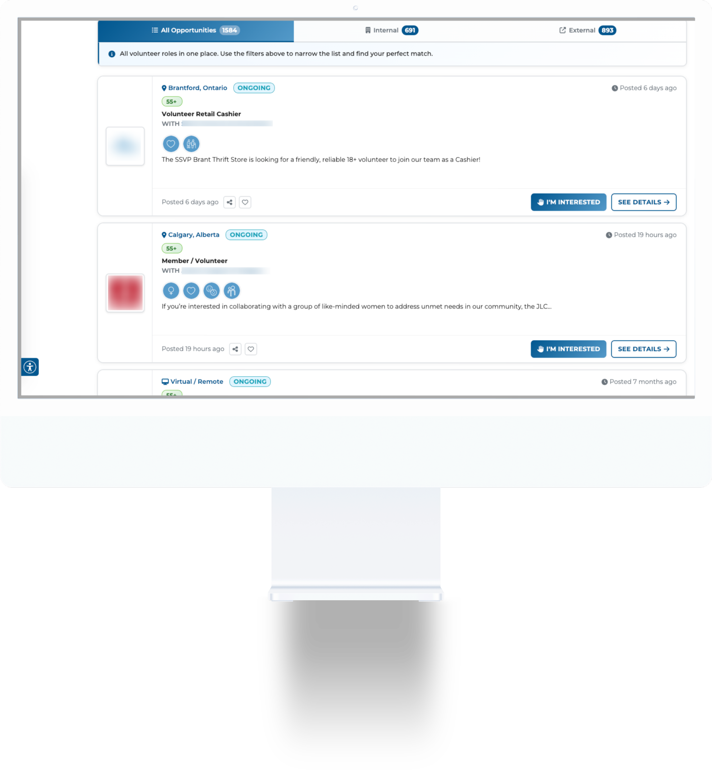
Volunteer opportunities list view page on a desktop computer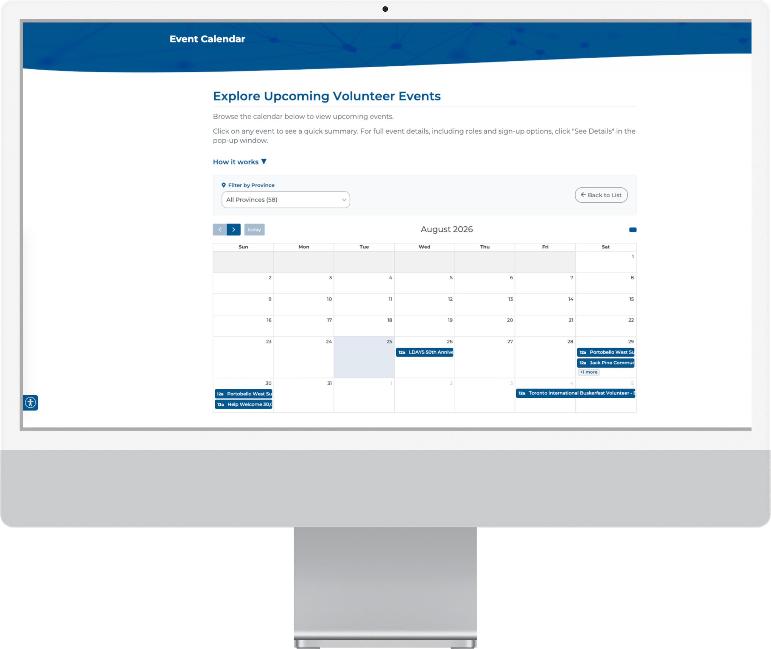
Volunteer opportunities calendar view page on a desktop computerSupporting different ways to browse
Different browsing behaviors called for flexible ways to scan and discover opportunities.
Different views gave volunteers more control over how they browsed the opportunity list. We had a map view at one point, but found it too expensive when traffic increased and disabled it.
The list view was supported by usability testing, showing some users liked to process one opportunity at a time and scroll through a single column list from top to bottom.
Our plans for a calendar view for the events became a confirmed feature by user support tickets requesting a similar viewing option. It created a way to see opportunities in a calendar.
The main differences between the views are:
Grid
Responsive rows of up to 3 cards each, with 12 results per page by default
List
A different card view in a single column
Calendar
A calendar with opportunity titles displayed on the dates they are scheduled
Search & Quick Filters
Keep It Super Simple.
To reduce cognitive load and choice overload on the user, we simplified the filters to the most commonly used, user goal oriented, and added a secure, shareable URL for filtered results. We also added a reset button to help the user clear all the filters and restore the full list.
Search
Needs to be accurate
Loading skeleton
Suggest keyword, opportunity, or organization
Keyboard accessibility
Enter/Return key
Quick Filters
Simplified filters
Helps sort related volunteer opportunities with a click

Search and quick filters section above the volunteer opportunities listedThe opportunity card
Designed to make opportunities easy to scan and understand at a glance.
The challenge for the opportunity card was how to group the dense information in a way that is more scannable for the users. In a team meeting, we decided the information on every card should at least answer what, where, when, why, and who for the volunteer.
The card must display:
Organization logo or opportunity image
Opportunity title
Organization name
Short description
Location of opportunity
Primary action
I’m Interested (sign up or sign in)
Event or Ongoing role
Relevant suitability badges
Using icons and white space helped separate the dense information and make the card easier to scan. The location was challenging because there were three main types: on-site, no fixed address (later changed to in-person), and virtual. At first, I had three colors at the top of the card, but that became too confusing to 2 of 5 users during usability testing, so the purple header background was removed. And since on-site and in-person are essentially the same thing, the header was reduced to two colors. Green indicates in-person and on-site opportunities and blue indicates virtual opportunities. The type of opportunity (event or ongoing) was added as a badge to the card header for easy identification.
2022 Initial opportunity cards
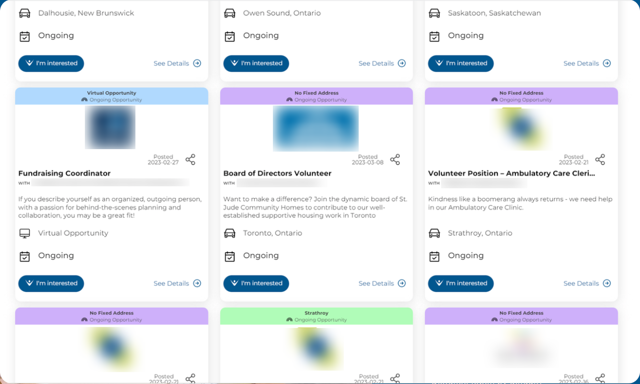
2023 volunteer opportunity cards
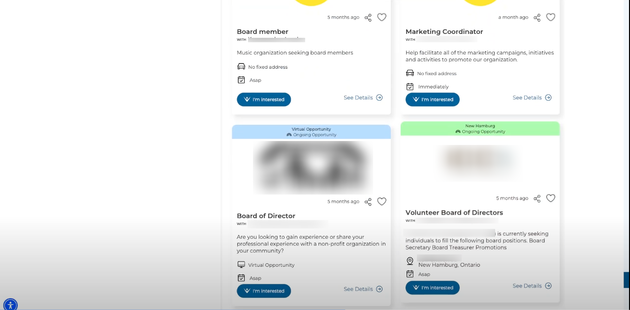
2024 volunteer opportunity cards

2025 volunteer opportunity cards

2026 volunteer opportunity cards
Refining the End-to-End Experience

Tooltip displaying over the student quick filter and the accessibility button in the lower left hand corner of the pageKeeping browsing fast and easy to resume
Two fixes reduced friction as volunteers moved from browsing toward sign-up or registration.
Preserving list position
Volunteers often clicked “See Details” to open an opportunity, then returned to the list to keep browsing. That triggered a full page reload and reset their scroll position, forcing them to re-find where they left off. Fixing this preserved list position on return and kept discovery fast and frictionless.
Pagination over infinite scroll
Infinite scroll was replaced with pagination due to performance limitations at scale. Pagination gave the large opportunity set clearer boundaries and more filtering and display customization.
User help
We found that users avoided clicking buttons when the labels left them unsure what would happen. Tooltips on buttons and links clarify the action or destination, helping users understand what to expect before they click.
Beyond discovery
Discovery was the core journey, but the underlying goal was converting browsing into sign-ups and volunteer registrations.
The business goal was to turn opportunity discovery into completed “I’m Interested” submissions and volunteer registrations. Sign-in, registration, and opportunity actions had to work together while respecting the different permissions of anonymous visitors, volunteers, and organizations.
Connected features that support the Opportunities page and help drive conversions include:
Opportunity detail page
Opportunity wizard
External opportunity form
“I’m Interested” flow
Manage opportunities
Manage volunteers
Manage sign-ups
Proper linking to sign-in and sign-up pages
Routing data to the correct page based on account state
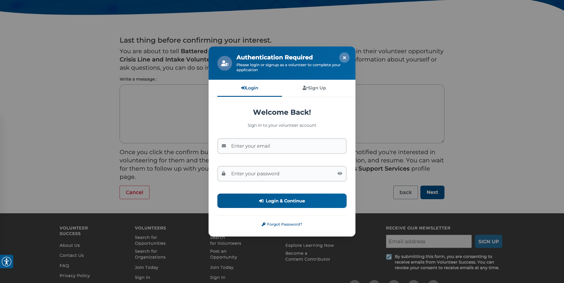
Authentication modal to login or sign-up new volunteer account
Final shipped Volunteer Opportunities page at handoff, showing the production card pattern and real content at scaleResults
From opportunity discovery to completed interest.
The final experience established the Opportunities marketplace as the platform’s primary discovery path, supporting both open-ended browsing and more intentional searches across opportunity inventory supplied by organizations and our team. More importantly, it connected that discovery experience to one of the platform’s core conversions: a completed “I’m Interested” submission. While the available reporting is approximate, the results was a slow and steady growth and usage.
Approximately 12,000 monthly visitors and growing
15.5% average page bounce rate
Continued platform growth to over 2K active volunteers and 1.8K charitable organizations.
The “I’m Interested” flow had a 25.3% conversion rate
Customer support helped volunteers find relevant opportunities through the shareable URL
Final thoughts
Good design only ships as well as the system underneath it can support.
Working on the Opportunities page reinforced how closely the user experience depended on the platform underneath it (even this page has it’s limitations and compromise has to be made). Earlier versions were constrained by a frontend and backend that were no longer well aligned, limiting the components we could reliably implement and making consistency harder to maintain. After upgrading the technology stack, we could use newer components, improve performance and accuracy, and maintain a more consistent experience across the platform.
On a small team, designing within a system we all understood was more practical than pushing for something unnecessarily custom. That tradeoff helped us ship faster, iterate more easily, and maintain the experience as the marketplace evolved.
The page also created value beyond its original scope. Customer support began using it to find and share relevant opportunities directly with volunteers. Supporting that behavior led to secure, shareable search URLs and showed how decisions made for discovery could support workflows we had not originally anticipated.

The final experience was shaped by both the interface volunteers see and the platform supporting it underneath